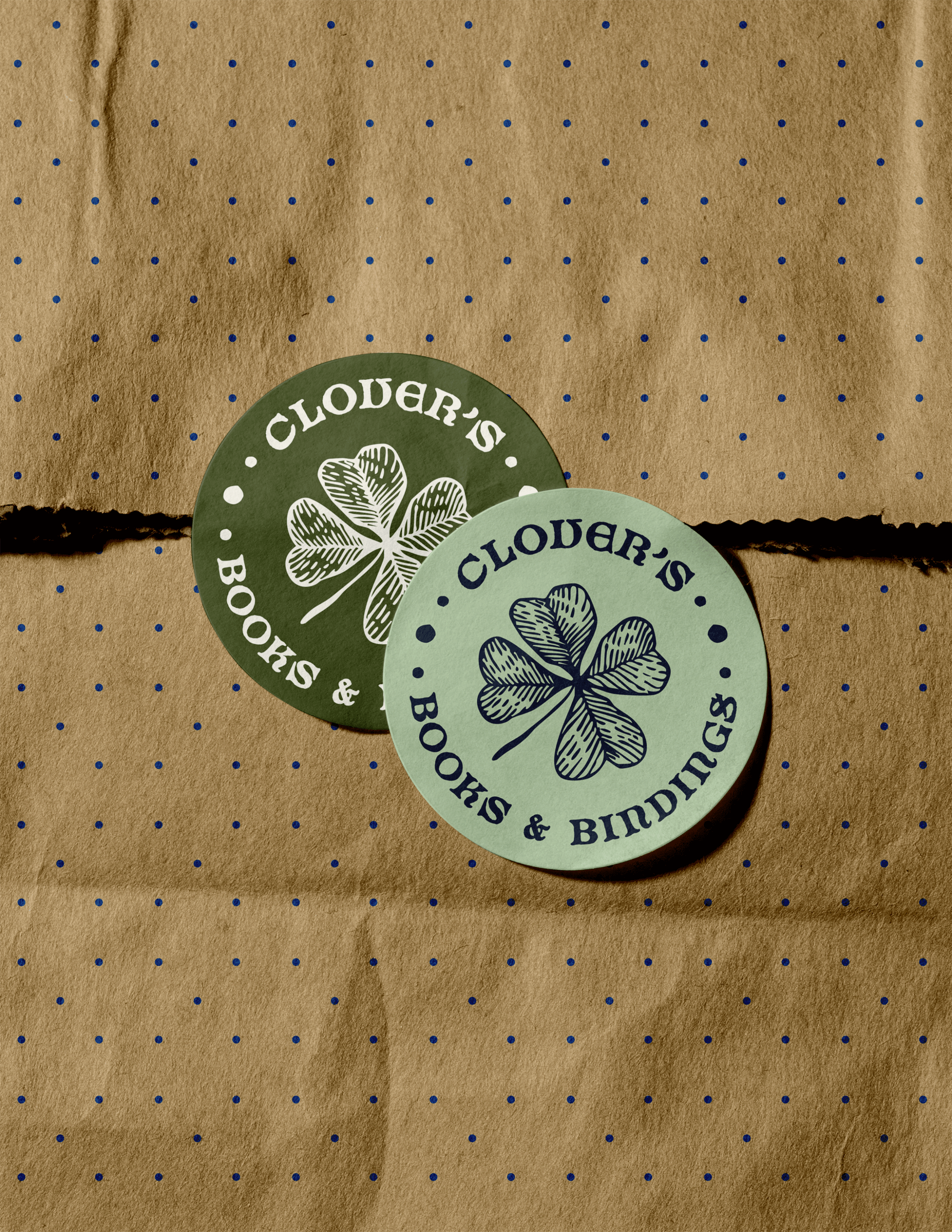
Clover’s Books & Bindings
Student ADDY WINNER
〰️
Student ADDY WINNER 〰️
The Scope
Clover’s Books and Bindings is a bookshop and personalized bookbinding studio created around a love of literature, craftsmanship, and community. The brand needed an identity that could communicate its warm and inviting atmosphere while providing a sense of adventure before even opening a book. The scope included developing a visual identity that could drawer readers in for more like the hook of a good story.
The Solution
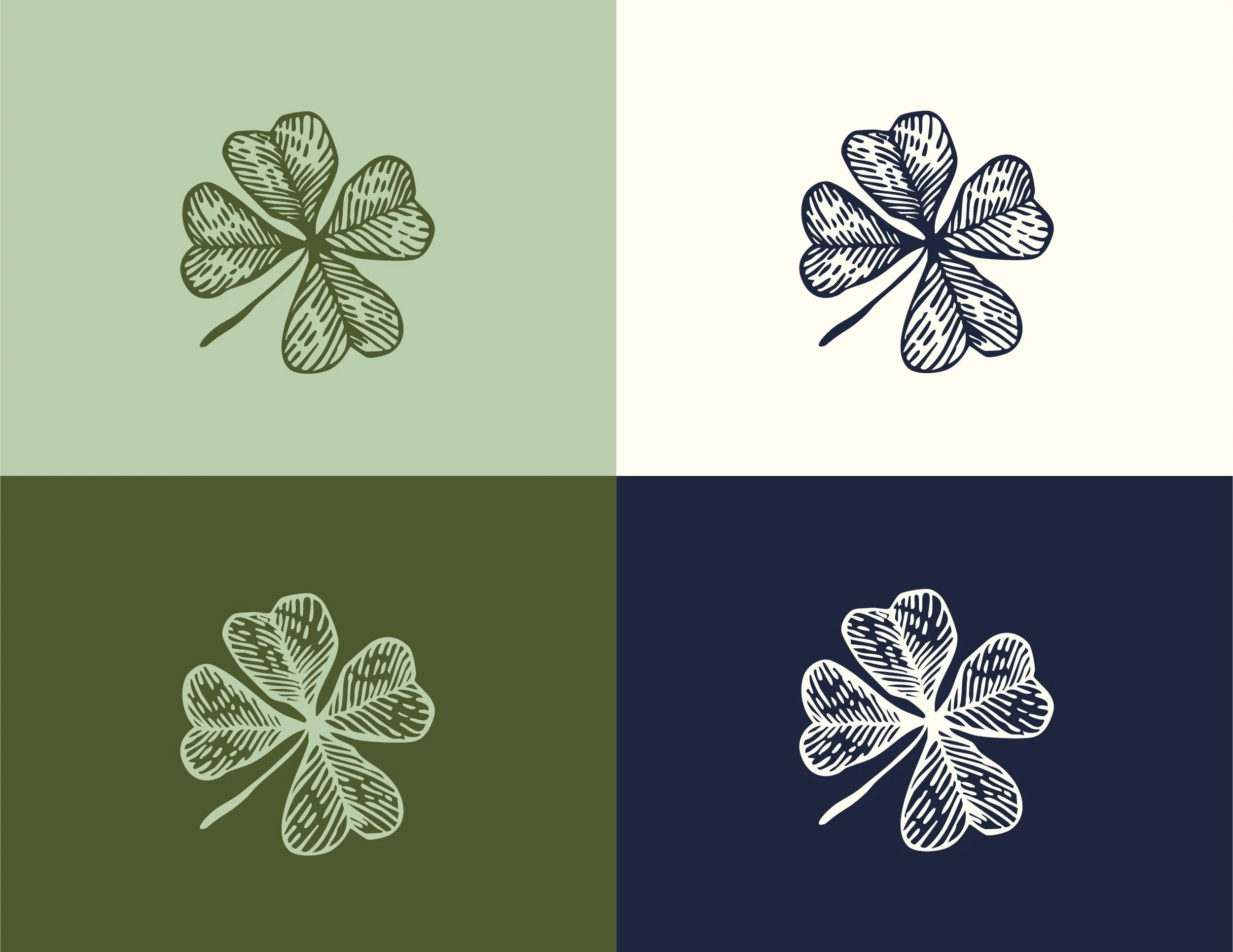
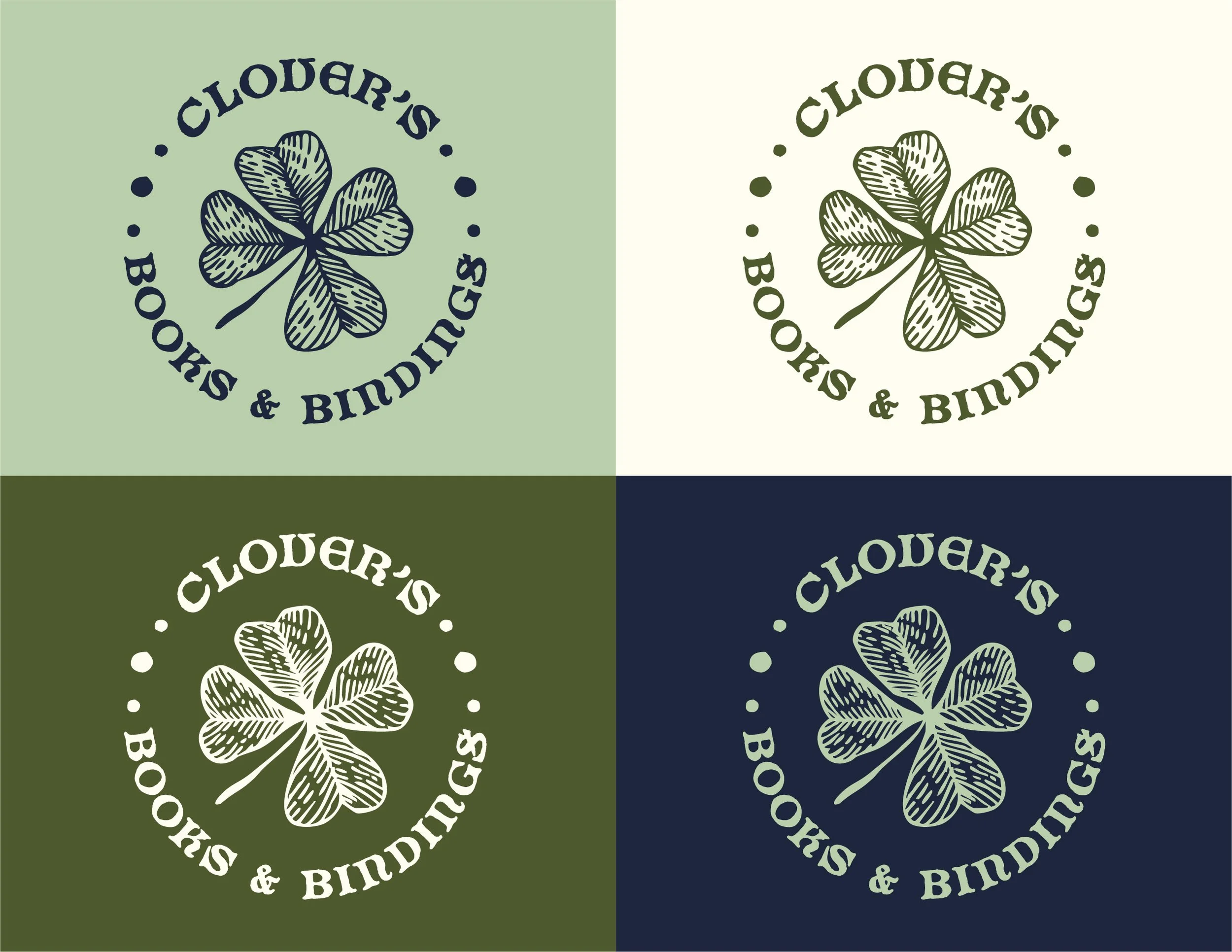
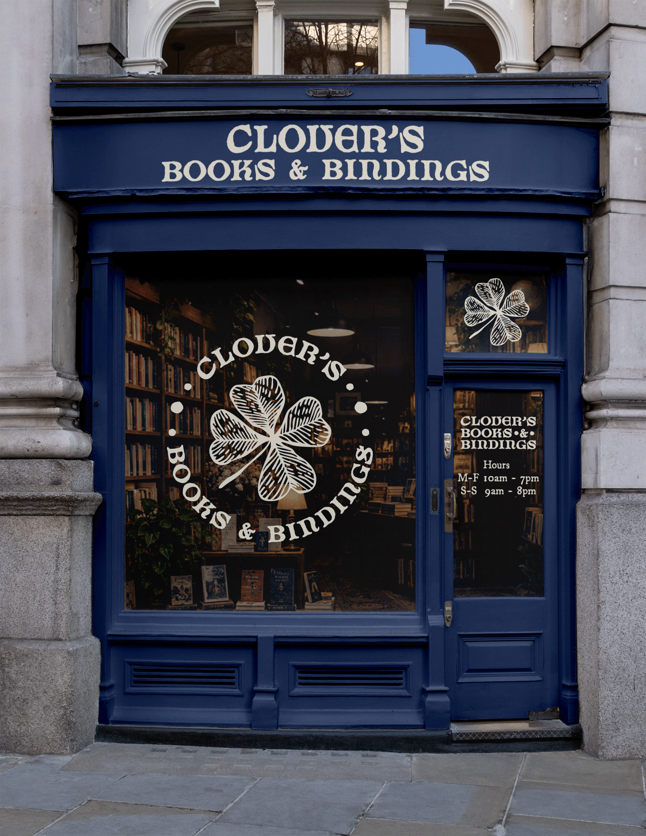
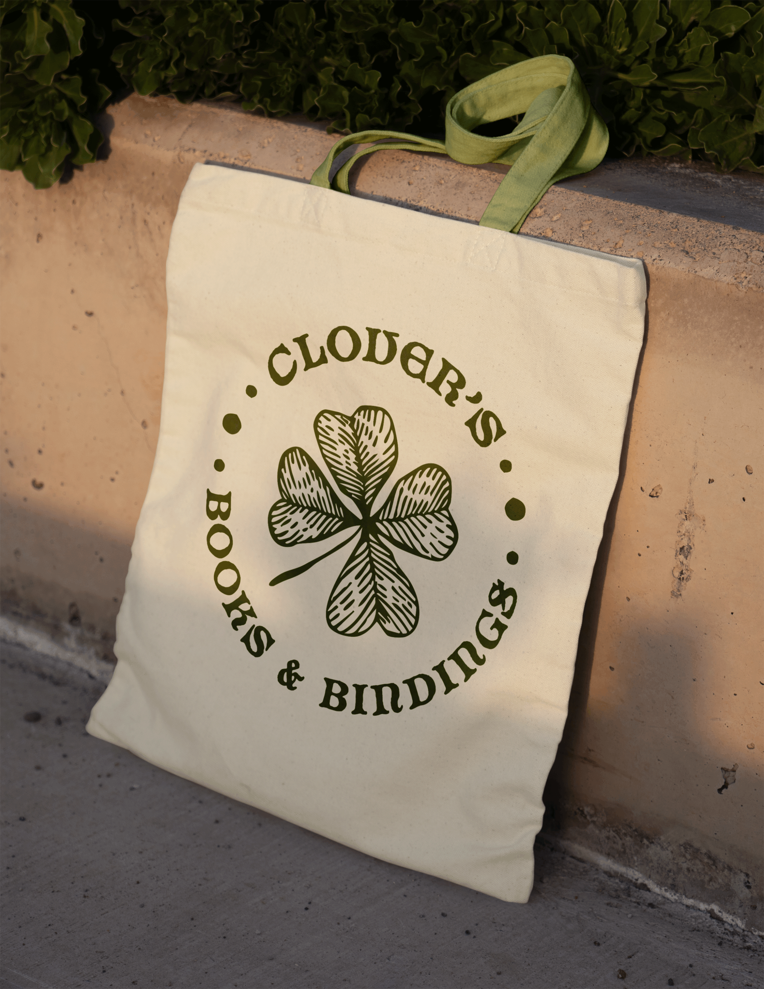
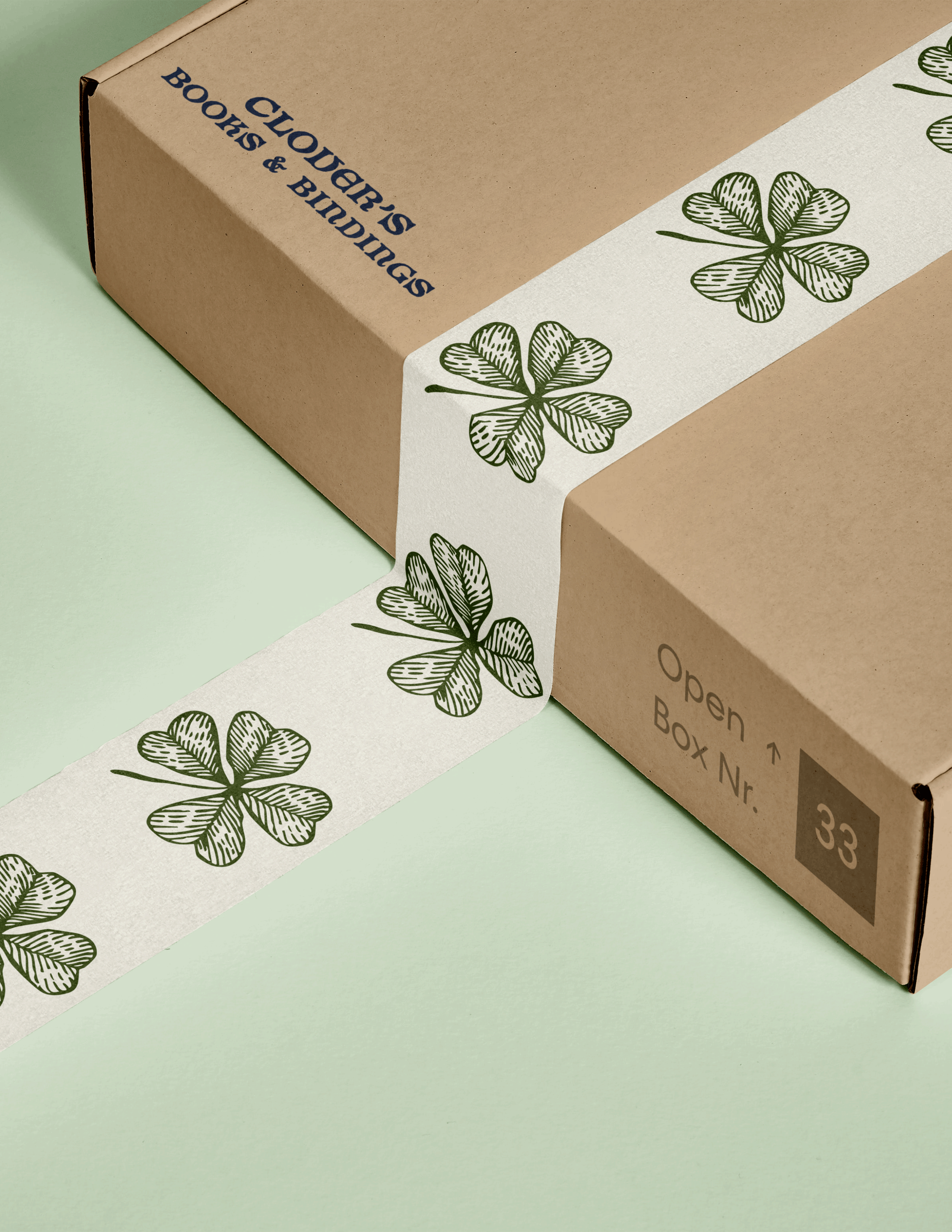
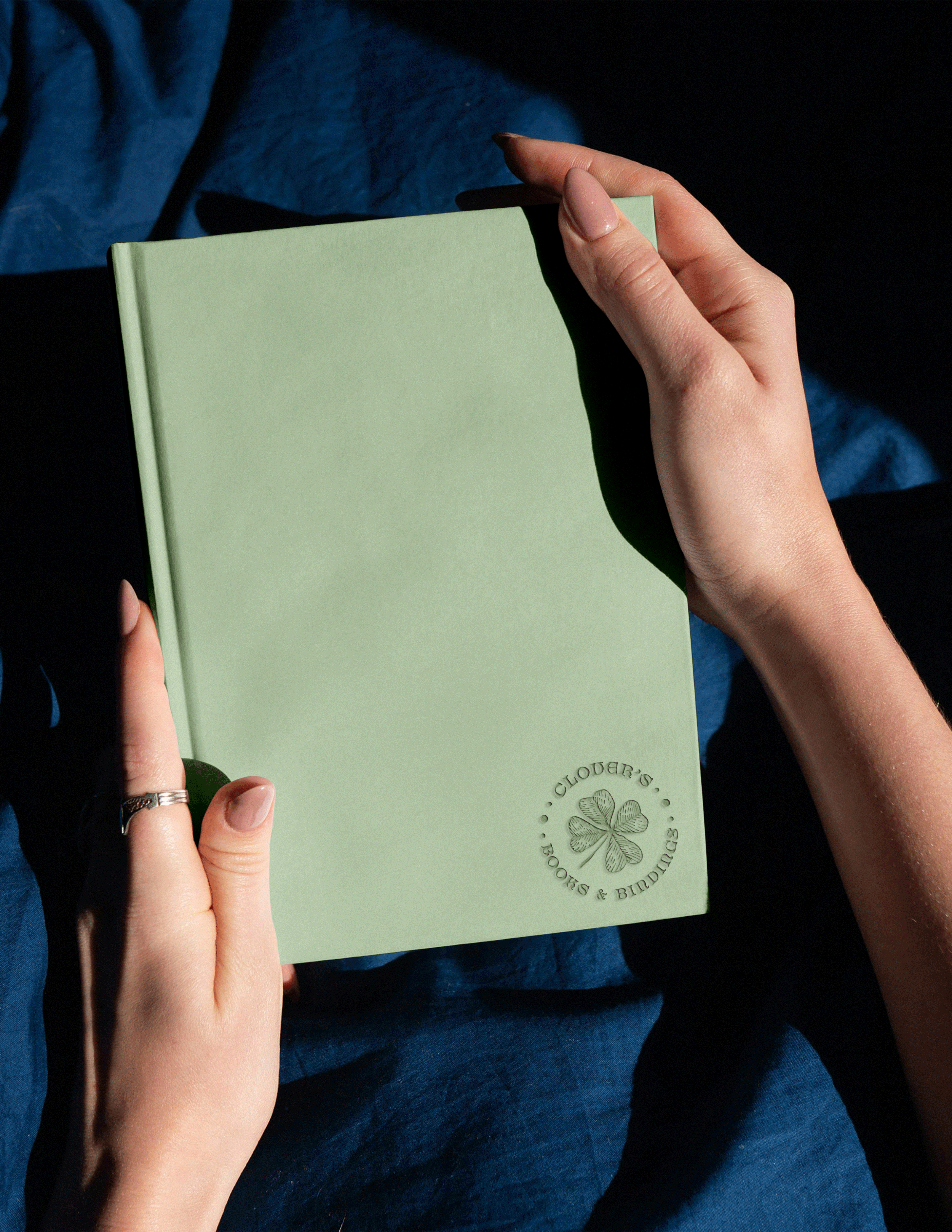
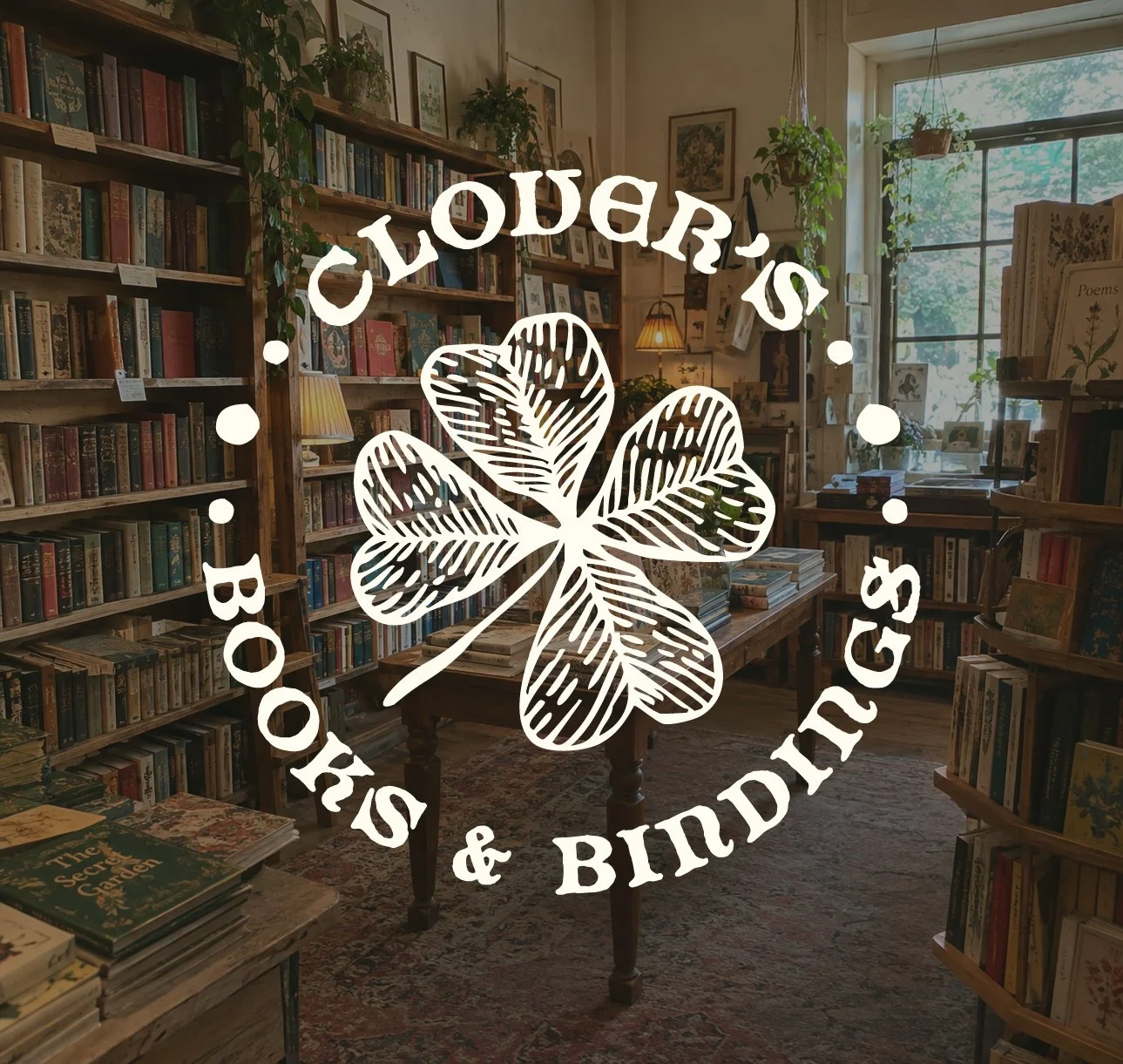
The identity was developed around the idea of a well-loved bookshop with a handmade touch. A four-leaf clover became the foundation of the logo, while the hand-drawn lettering and illustrated details give the mark a tactile, imperfect quality. Together, these elements create an identity that feels personal and established, while leaving room for the brand to extend naturally across the shop’s books, binding services, and handmade goods.
The Process
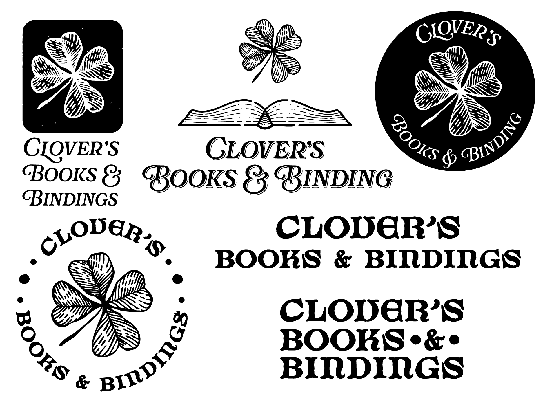
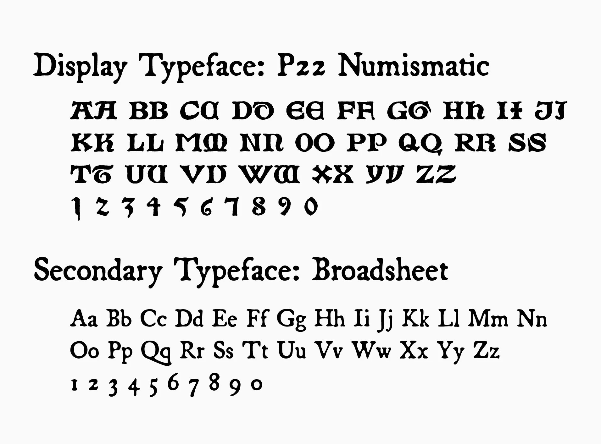
The identity began by defining Clover’s personality and the experience the brand wanted to create: warm, welcoming, and whimsical. From there, I explored ways to visually connect the ideas of literature, craftsmanship, and discovery while keeping the identity approachable and distinctive. The final identity brings these elements together into a mark that feels like it could belong on a bookplate, a handmade binding, or a sign outside a cozy neighborhood bookshop.